-
Understand your Websites Mobile Performance using Google Analytics
26th June 2013
Mobile websites have been a buzz topic for some time now, but with the recent growth in Responsive Web Design, the mobile topic seems to have gone to a new level. So has the variety of questions related to the development of a mobile site. Should you have one? Should you not? How should it be built? What devices should you target? Will it all be worth it?
It’s hard to avoid buzz topics. It’s particularly hard to do so with discussions around mobile because, whether you’re technical minded or not, you can still see that most people are walking around staring at a smartphone – so you understand it is probably important, and something that will need addressed at some point.
One of the best places to start your decision making process is simply to better understand how your website currently performs on mobile devices. Appreciate the buzz, and understand that it’s something that will probably have to be addressed, but use the data already at your fingertips to allow for some objective input and prioritisation of importance.
Google Analytics Mobile Reports
Segmentation and Custom Reports within Google Analytics allow you to see Mobile user activity in a wide variety of forms, but for now we’ll focus on an easy to use (though under-used!) report that all Google Analytics users have access to: The Audience Mobile report.
To find it, simply login to your Analytics account, click Reporting in the orange bar across the top of the page, then click on the Audience tab in the left menu. Once clicked, you’ll see the Mobile sub menu. Select it, and then the resulting Overview option.
Mobile Overview Report
You should now be looking at a report similar to this:
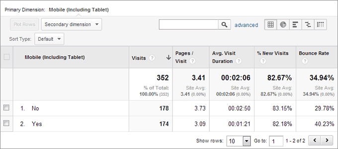
Mobile Users Report from Google Analytics
It’s a simple comparison of data between those who visited your site via a mobile device, and those who used a non mobile device. The main stats in this report are similar to those in most other Analytics reports – Visits, Pages per visit, Visit duration, New Visits and Bounce rate.
Goal & eCommerce Options
You also get options (just above the chart) to view Goal & eCommerce information for both mobile and non-mobile audiences.
The above screenshot is a good example of what can be understood about your site on mobile devices. For instance, we can see in the measured time frame of this example, that visit numbers were similar for mobile and non-mobile. However, we can also see that those coming from a mobile device spent roughly half as much time on the site and that on average 40% of visitors bounced, compared to 29% from non-mobile devices. This could suggest the site is harder to navigate and read on a mobile site. It’s the same content, so there may be something about usability that’s causing the difference per device.
More importantly is the comparison of conversions. By clicking the Goal option above the chart, you can compare goal performance between mobile and non-mobile users. In this example, we found that non-mobile users convert at a rate of approx. 6.7%, compared to just 3.4% on mobile devices.
Mobile Devices Report
As well as the comparison between mobile and non-mobile, you can also see which mobile devices people are using, which may help you in prioritising the focus of your development.
The screen below details the devices used by the 174 mobile users in the above report.
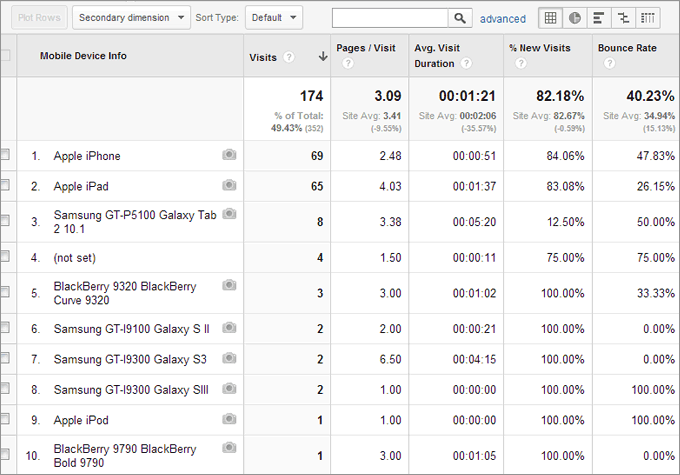
Google Analytics Mobile Devices Report
It’s quite clear here that Apple devices account for the majority of mobile visits, and that iPad and iPhone visit volumes are similar. However, we can again see differences in Time on Site and Bounce Rates. Various factors could be causing the difference, but the most obvious consideration would be the size of screen on each device.
For info, over the measured time period, there were 27 different mobile devices viewing this website.
Going Mobile …
We’ve actually just started working on a responsive development project on the case study site, upgrading it to work fluidly with different mobile devices. The general design will remain exactly the same. The only difference will be the layout on mobile devices. On the current version, users have to zoom in to read the content and the navigation is difficult to use. On the upgraded version, content will exactly match the main site, but areas will move and re-size to allow easy browsing on tablets and smartphones. We’ll post a follow up in a month or so to see if the upgrade to a mobile friendly site improves the above figures any!