-
Plot Multiple Rows in your Google Analytics Charts to find Trends
31st July 2013
The Plot Rows option within Google Analytics is a feature that provides very quick access to visual versions of the main analytics reports.
It works simply by selecting checkboxes and pressing a button, but is often overlooked in favour of the more complex reports. It can, however, aid in making more sense of the standard Google Analytics data tables, particularly for those who are not fans of the standard data tables.
Plotting Rows? What exactly does it do?
Most reports within Google Analytics show a chart and a data table. The data table displays rows of elements. Depending which report you’re looking at, those rows of elements might be individual keywords, landing pages, traffic sources etc.
The chart above the data table plots a single average measurement for those rows of elements. It normally defaults to Visits, but you can change to various other measurements (bounce rate, pages per visit, Goal related measurements, eCommerce measurements etc).
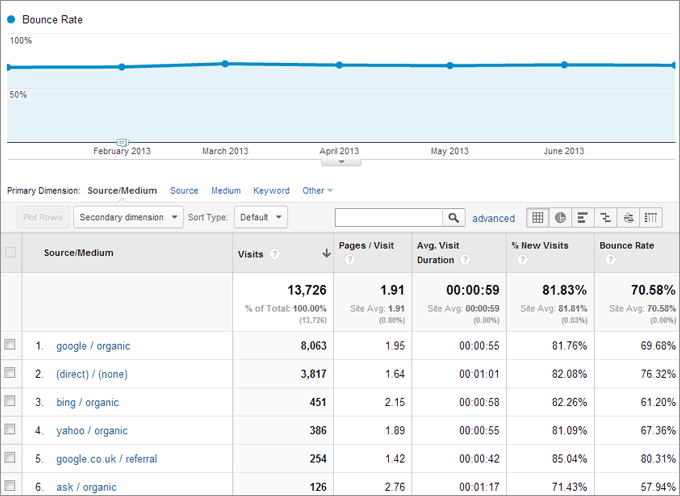
Standard Traffic Sources report, with chart plotting average Bounce Rate
The Plot Rows button allows you to compare individual elements against the default average within the chart, for whatever measurement you choose. Where the above screen shows average bounce rate from all Traffic Sources over a 6 month period, the screen below shows the same chart, but with bounce rates of 4 search engines (Google, Bing, Yahoo, Ask) plotted against the site average.
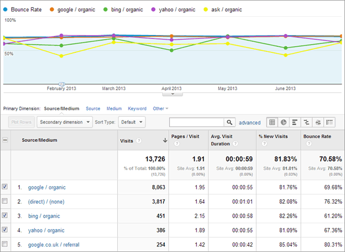
Standard Traffic Source report, using Plot Rows to compare individual bounce rates.
Now, we know Google is by far the largest driver of traffic from the selected search engines, and we can see from the data table that it has the highest average bounce rate over the measured period. However, this more visual chart allows us to see the fluctuation in bounce rate each month for each engine, and it makes it easier to compare specific elements rather than scrolling through the data table.
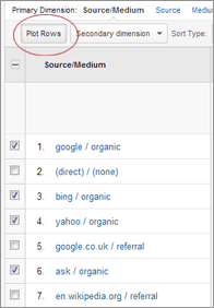
The Plot Rows button
Using the Plot Rows Feature
The Plot Rows button[/caption]Plotting additional rows within the chart is straightforward. Simply navigate to the report you want to use (in the above example we’ve used Traffic Sources > Sources > All Traffic). Scroll down to the data table and select the checkbox next to each row you want to plot. Scroll back up and press the “Plot Rows” button.
Note: The Plot Rows button is easily missed, as it’s faded out by default. It only appears more visible when you’ve selected at least one checkbox.
On which reports might Plot Rows be used?
The Plot Rows feature will not give you all the answers, but it can highlight areas where further analysis might be required, or at least help prioritise ongoing analysis.
Some common uses of the Plot Rows feature that we’ve been involved in, which have led to further analysis and development, have included:
- Comparing Pages Per Visit from specific mobile devices (are there site issues on certain devices?)
- Comparing Bounce Rates from various organic search keywords (are you focusing on keywords that actually generate quality traffic?)
- Comparing Goal conversion rates from different browsers (are forms working properly on all browsers?)
Most default reports within Google Analytics include the Plot Rows feature. It’s certainly more useful on some reports than it is on others, particularly for quick visual overviews of data.