In digital marketing and website optimisation, business owners often focus only on driving traffic. Whether that’s through implementing SEO best practices, cost-effective PPC campaigns through platforms such as Google Ads, Microsoft Ads or Facebook Ads, or engaging with potential customers on social media. One important thing to consider though, is what happens once that traffic lands on your actual website?
If your website’s performance feels like it could be doing better, your conversion rates are persistently low, or if you’re simply not sure your digital marketing is working, the issue is often not traffic volume; it’s the experience your visitors have once they arrive on your website.
This is where User Experience (UX) and Conversion Rate Optimisation (CRO) meet. Think of User Experience as the quality of the journey, and Conversion Rate Optimisation as the result of that journey. Together they can help visitors who reach your website take the best path to converting, whether that’s purchasing a product or service, or contacting your online business for an enquiry. This quick guide lists a few key points of user experience you can implement today to make your website much friendlier for visitors, leading to more sales and business.
Why is User Experience important?
Many online businesses treat User Experience as an aesthetic concern, focusing only on pretty visuals or fancy designs. At Aillum, we view User Experience as a critical business tool, one which is frequently overlooked. It is the practice of ensuring that your website is easy, efficient, and enjoyable to use.
For a real world comparison, think about shopping at a supermarket. An example of user experience there would be having fruits and vegetables near the entrance, to give visitors a sense of health and freshness, followed by daily essentials, such as bakery and daily options, so that visitors start putting items into their basket (a literal one!) as soon as possible. The products are cleanly organised by category (aisles) with clearly labelled sections, and are designed to guide visitors eventually to the checkout, where there’s often last-minute extras to tempt adding one last product (chewing gum, sweets, chocolate bars, snack foods) before going through the checkout process. Imagine if a supermarket was difficult to navigate, or it was impossible to find what you were looking for – you simply wouldn’t shop there!

If someone visiting your website cannot easily find the information they need, understand what action they should take next, or complete a form without frustration, they will leave. Optimising for conversions becomes increasingly more difficult with a poor User Experience.
Improving User Experience is a low-cost, commitment-free way to evaluate and significantly improve the effectiveness of your website and digital marketing efforts.
What defines a good User Experience?
Effective User Experience can be broken down into a few key points that directly lead to better conversion metrics, higher return on investment for your digital marketing, and cleaner data in your Google Analytics 4 reporting.
1. Visual Clarity and Findability
Every click, scroll, and moment a user spends confused on your website is an instance of friction that could potentially prevent a conversion by causing them to leave. Visual clarity is the most important element of a good User Experience, as it makes navigating and interacting with the website as smooth as possible.
- An Example Problem: Users are spending too long finding the pricing or booking page.
- Solution: Ensure all headlines are clear, Call-to-Action (CTA) buttons stand out on the web page, and the navigation is instantly understandable, such as using familiar and literal terms like “Services,” “Pricing,” “Contact Us” or “Book Online Now”.
2. Consistency and Building Trust
Website visitors want predictability. When your website is inconsistent, for example using a green button for “Next” on one page and orange for “Next” on another, or changing font sizes and styles between sections, you create a sense of mistrust and confusion. Your website should not be a puzzle that needs to be solved.
- An Example Problem: Users abandon the checkout process halfway through.
- Solution: Maintain absolute consistency in button styles, form fields, and language across the entire checkout path. Use expected and predictable language, as maintaining consistency reduces the cognitive load required of visitors to navigate your site.
3. Efficiency and Flow
Efficiency is about minimising the steps, clicks, or time it takes for a user to achieve their goal, whether that’s making a purchase or submitting an enquiry. Improving flow this way, by removing and limiting friction, can directly improve funnel completion rates and lead to higher conversion rates.
- An Example Problem: High bounce rate on the newsletter sign-up form.
- Solution: Only ask for essential information. Implement features like auto-fill, drop-down menus instead of free-text fields where possible. For example, while it might be useful to ask “Where did you hear about us?” a drop down is a lot simpler and faster than asking users to provide a description manually. For example, our own newsletter signup below only needs your name and email and we can send you digital marketing tips to help improve your website further.
5 Ways to improve User Experience on your website
You don’t need a complete website redesign to start seeing conversion rate optimisation improvements. Focus on these small, impactful changes that address common user experience frustrations.
1. Prioritise What Should the User See First
Visual hierarchy dictates how the user’s eye moves across the screen. You should ensure the most important elements, the primary value proposition and the main CTA, are the most dominant and easy to spot.
- Use clear, contrasting colours only for your primary conversion buttons.
- Use larger font sizes and bolding for key headlines and benefits.
- Employ ‘whitespace’ (empty space) around important elements to draw the eye to them. If a web page is too “busy”, it can look cluttered and confusing to users.
- Consider making your primary conversion button (such as “Book Now”) remain on the page, while users scroll, so they always have easy access to it.
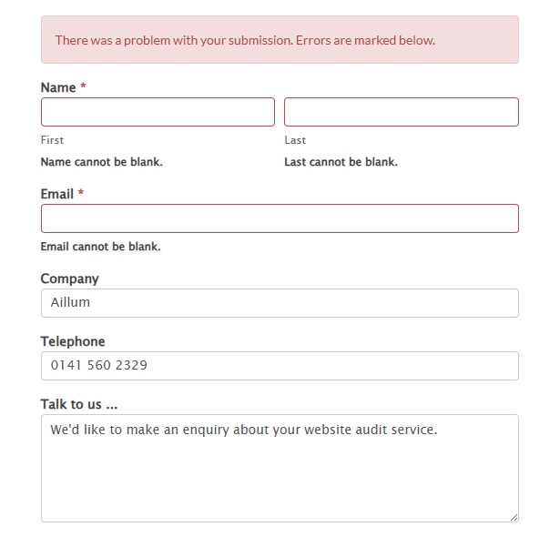
2. Define Your Microcopy
Microcopy is the small text used on buttons, error messages, and form labels. It guides the user, gives them predictable expectations and relieves anxiety.
- Instead of a generic “Submit” button on sign-up forms or enquiry forms, use descriptive microcopy like “Download Your Free Audit,” “Start 30-Day Trial,” or “Get My Custom Quote.” so that users know precisely what to expect.
- Turn confusing error messages, such as “Error Code 1093”, which has no real meaning, into helpful guidance, such as “Please check that your postcode is in the correct format” instead.
3. Optimise for Mobile
In 2026, most internet traffic will arrive on your website from mobile devices. If your website experience on a smartphone is poor, you are losing a majority of your potential conversions.
- Ensure all buttons and clickable elements are large enough and spaced far enough apart to be easily pressed by a thumb. Being finger-friendly is important and often forgotten.
- Use font sizes and line heights that are easy to read on a small screen for accessibility. Test your forms on mobile devices. Can a user enter their details easily without excessive zooming or scrolling?
- While buttons and clickable elements need to be large enough, ensure that your website looks (and functions) correctly on mobile devices and are fully mobile responsive. This includes formatting, images, and other elements that tend to get resized for mobile displays. Remember to check your navigation / hamburger menus as well, these often get overlooked but are vital for moving around websites on mobile.
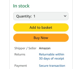
4. Provide Clear Feedback
Users need to know their actions have been successful. The lack of feedback causes anxiety (“Did the order get placed? If I submit again, do I buy twice?”) and repeat clicks, leading to frustration.
- When a user clicks ‘Add to Basket,’ a clear message or animation should appear confirming the item was added, usually alongside a subtle nudge to “View Basket” or “Continue Shopping.”
- After submitting a form, don’t just clear the page or provide no feedback. Give a visible, polite confirmation message or immediately redirect them to a “Thank You” page, which you can track as a key event in Google Analytics 4.
5. Minimise User Decisions & Thinking
It is known that the time it takes to make any decision increases with the number and complexity of choices (think about when someone asks you for your favourite movie, song or food!). When faced with too many options, users often freeze and leave.
- Keep your main menu concise and limit navigation choices. Too many top-level items dilute focus. Make use of dropdown menus to provide easy steps for visitors to follow, to find what they’re looking for.
- Simply choices where possible. Instead of offering 10 different product tiers on your main page, show 3 (Good, Better, Best) and use clear comparison charts to simplify the decision-making process.
- Have a significantly large amount of products or services? Try not to overwhelm visitors by minimising the options available by showing a curated selection of popular or key products (i.e. Best Sellers, Top Brands) to give them a place to begin browsing what you offer.
Measuring the impact of User Experience changes
User Experience is not a one-time fix; it’s a continuous, data-driven cycle. By applying these initial changes, you will naturally reduce friction and improve your website conversion rates.
To truly understand the impact of these changes, you should track your website performance using tools like Google Analytics 4. You need to know where users are struggling (high exit rates, low engagement, slow load times) before you can know what to fix or where bottlenecks might be occurring. We always recommend testing your changes with data, rather than going on intuition. If you believe a button colour change will boost conversions, use an A/B test to check hundreds or thousands of sessions. Don’t rely on gut feeling, rely on the data and results.
If a lack of technical knowledge or cost is holding you back, our focused Website Audit can provide you with a list of tailored recommendations and the start of a digital plan to make your website perform better for the long-term. If you have any questions about improving your website, feel free to contact us today!