If you have a website, you’re hopefully aware of the free Page Speed Tool offered by Google to help site owners optimise their websites for better loading speeds. It provides feedback and recommendations on everything from optimising images, to minifying CSS and HTML.
We provided an overview of the Google Page Speed tool back in July 2013, though the tool has evolved since then, both in how it looks and how it reports its feedback.
The most recent upgrade to the tool has just been announced by Google, with additional feedback now available on some Usability aspects of mobile websites.
If you’ve optimised for mobile, you should score quite high, though you might still find a suggestion or two for further improvement (we found a useful suggestion for the Aillum mobile site!). If you haven’t optimised for mobile, you’re about to get some extra feedback.
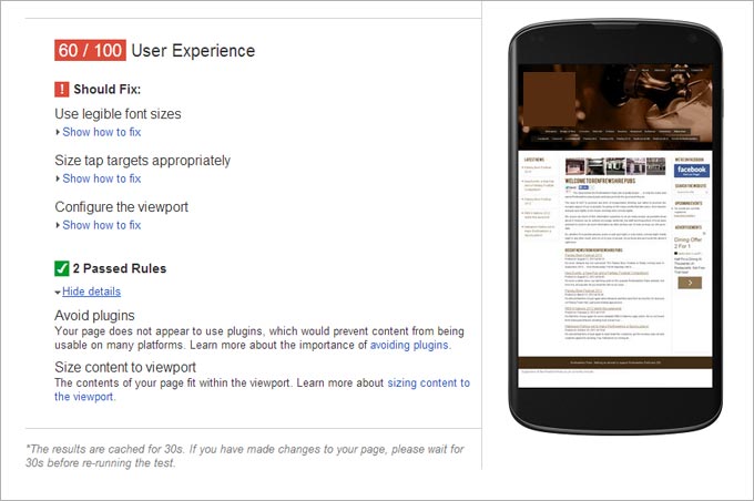
Specifically, Google now provides feedback on (taken from the Google Webmaster Central blog):
- Configure the viewport: Without a meta-viewport tag, modern mobile browsers will assume your page is not mobile-friendly, and will fall back to a desktop viewport and possibly apply font-boosting, interfering with your intended page layout. Configuring the viewport to width=device-width should be your first step in mobilizing your site.
- Size content to the viewport: Users expect mobile sites to scroll vertically, not horizontally. Once you’ve configured your viewport, make sure your page content fits the width of that viewport, keeping in mind that not all mobile devices are the same width.
- Use legible font sizes: If users have to zoom in just to be able read your article text on their smartphone screen, then your site isn’t mobile-friendly. PageSpeed Insights checks that your site’s text is large enough for most users to read comfortably.
- Size tap targets appropriately: Nothing’s more frustrating than trying to tap a button or link on a phone or tablet touchscreen, and accidentally hitting the wrong one because your finger pad is much bigger than a desktop mouse cursor. Make sure that your mobile site’s touchscreen tap targets are large enough to press easily.
- Avoid plugins: Most smartphones don’t support Flash or other browser plugins, so make sure your mobile site doesn’t rely on plugins.
Test out the Google Page Speed tool here: http://developers.google.com/speed/pagespeed/insights/